Control charts for rubber colour#
A short series of 100 colour readings on rubber product. Each reading is a single value that should sit close to a target, with run-to-run variation small relative to the spread that signals a process upset. The job of a control chart is to draw a target line and limits, then flag readings that fall outside.
Data. rubber-colour.csv from openmv.net. One column, no missing values, no ordering metadata; the values are assumed to be in sample order.
What we do. Build three charts:
A classical Shewhart chart using the standard mean and standard deviation, which mirrors what the R
qccpackage produces withtype="xbar.one".A robust Shewhart chart using the median and a MAD-based scale estimate, which is less sensitive to the same outliers it is trying to flag.
A Holt-Winters chart that blends recent history with the long-run target, useful when the series drifts.
Adapted from the Process monitoring chapter of the Process Improvement using Data book (CC BY-SA 4.0).
[1]:
import matplotlib.pyplot as plt
import numpy as np
import pandas as pd

from process_improve.monitoring.control_charts import ControlChart
Load and look#
[2]:
data = pd.read_csv("https://openmv.net/file/rubber-colour.csv")
y = data["Colour"].astype(float)
print(f"{len(y)} readings, mean={y.mean():.2f}, sd={y.std(ddof=1):.2f}, range=[{y.min()}, {y.max()}]")
y.head()
100 readings, mean=238.78, sd=10.84, range=[220.0, 255.0]
[2]:
0    252.0
1    252.0
2    230.0
3    249.0
4    242.0
Name: Colour, dtype: float64
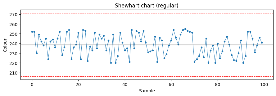
Classical Shewhart chart#
ControlChart(variant="xbar.no.subgroup", style="regular") plots each observation individually against limits computed from the sample mean and sample standard deviation. The R qcc package’s type="xbar.one" produces the same target and a very similar standard deviation estimate.
[3]:
cc_regular = ControlChart(variant="xbar.no.subgroup", style="regular")
cc_regular.calculate_limits(y)
print(f"target = {cc_regular.target:.2f}, s = {cc_regular.s:.2f}")
print(f"flagged indices: {list(cc_regular.idx_outside_3S)}")
target = 238.78, s = 10.84
flagged indices: []
[4]:
def plot_chart(y: pd.Series, target: float, s: float, flagged: list[int], title: str) -> None:
    upper = target + 3 * s
    lower = target - 3 * s
    _fig, ax = plt.subplots(figsize=(9, 3.2))
    ax.plot(y.values, marker="o", linestyle="-", color="#1f77b4", markersize=3, linewidth=0.7)
    ax.axhline(target, color="k", linewidth=1)
    ax.axhline(upper, color="r", linewidth=1, linestyle="--")
    ax.axhline(lower, color="r", linewidth=1, linestyle="--")
    if flagged:
        ax.scatter(flagged, y.values[flagged], color="red", zorder=5, s=40)
    ax.set_xlabel("Sample")
    ax.set_ylabel("Colour")
    ax.set_title(title)
    plt.tight_layout()
    plt.show()


plot_chart(y, cc_regular.target, cc_regular.s, list(cc_regular.idx_outside_3S), "Shewhart chart (regular)")
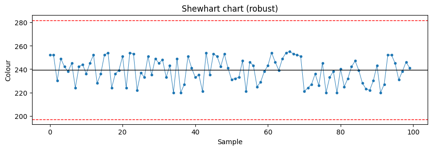
Robust Shewhart chart#
Replacing the mean with the median and the standard deviation with a MAD-based scale estimate prevents extreme observations from inflating the limits and hiding themselves. On a series with even a single outlier the robust chart usually flags more points than the classical chart, which is the desired behaviour: flag, then investigate.
[5]:
cc_robust = ControlChart(variant="xbar.no.subgroup", style="robust")
cc_robust.calculate_limits(y)
print(f"target = {cc_robust.target:.2f}, s = {cc_robust.s:.2f}")
print(f"flagged indices: {list(cc_robust.idx_outside_3S)}")
plot_chart(y, cc_robust.target, cc_robust.s, list(cc_robust.idx_outside_3S), "Shewhart chart (robust)")
target = 239.50, s = 14.08
flagged indices: []
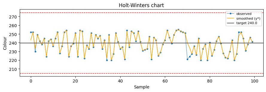
Holt-Winters chart#
The default ControlChart() is a Holt-Winters chart. It blends two smoothing constants, lambda_1 and lambda_2, with lambda_1=lambda_2=0.5 by default. This makes the chart respond to genuine process shifts while staying stable under random scatter.
[6]:
cc_hw = ControlChart()
cc_hw.calculate_limits(y)
print(f"target = {cc_hw.target:.2f}, s = {cc_hw.s:.2f}")
y_star = cc_hw.df["y_star"].astype(float).values

_fig, ax = plt.subplots(figsize=(9, 3.2))
ax.plot(y.values, marker="o", markersize=3, linewidth=0.7, color="#1f77b4", label="observed")
if len(y_star) and np.isfinite(y_star).any():
    ax.plot(y_star, color="orange", linewidth=1.2, label="smoothed (y*)")
ax.axhline(cc_hw.target, color="k", linewidth=1, label=f"target {cc_hw.target:.1f}")
ax.axhline(cc_hw.target + 3 * cc_hw.s, color="r", linewidth=1, linestyle="--")
ax.axhline(cc_hw.target - 3 * cc_hw.s, color="r", linewidth=1, linestyle="--")
ax.set_xlabel("Sample")
ax.set_ylabel("Colour")
ax.set_title("Holt-Winters chart")
ax.legend(loc="best", fontsize=8)
plt.tight_layout()
plt.show()
target = 239.95, s = 11.61
What to try next#
Pass an explicit
targetandstocalculate_limits()to use known design values rather than estimates from the same data being charted. This is the right choice once you have a reference period of stable operation.Investigate the flagged readings: do they cluster in time? Are they before or after a maintenance event? The chart only flags; the investigation belongs to you.
For multivariate process data, fit a PCA model and chart SPE and Hotelling’s T squared instead. See the PCA on tablet spectra case study.